Visualized spotlights visual artists in the music world.
Luke Drozd is an artist and illustrator that lives in South London. He’s achieved much notoriety for his unique and powerful concert poster designs for bands such as Animal Collective, Yo La Tengo, and Andrew Bird. His fine artwork is equally as compelling, but much different in approach. Drozd was kind enough to give us a moment to explore his creative past and present.
Can you tell us what led you to the path of visual arts?
I ask myself that very question every morning as I lie in bed contemplating my own existence. I suppose it just seemed like ‘the right thing to do’. There was no epiphany moment where I suddenly shouted, “I AM MEANT TO BE AN ARTIST!” It was just a lot more enjoyable than most other life paths. Apart from maybe Adventurer. Then again I do like being indoors so maybe Adventurer was always off the table. I was always drawing as a child and was encouraged to pursue it further by my parents and various teachers. It led me to study Fine Art at both BA and MA level and along the way I stumbled into the world of illustration and in particular that murky, wonderful world of gig poster design.
You’ve established yourself as a prominent gig poster artist/designer—how did you get your start in that field?
Thank you for that. I suppose I rarely think of myself in those terms (prominent that is not as a gig poster artist), but I guess to some extent that’s true. I certainly didn’t set out with a plan to be a gig poster artist, in fact I’m not sure I was aware that such a thing was possible when I made my first posters. Those initial posters came about as promotion for shows that myself and Drew Millward were helping out with in Leeds. We were running a small record label called Birdwar Records and it snowballed for the both of us from there. Meeting Jay Ryan at his first solo show at Richard Goodall Gallery in Manchester many moons ago was also somewhat of a catalyst. There were a few of the current UK poster nerds there (myself, Drew, Graham Pilling and Nick Rhodes for instance) and it bolstered us to push it a bit harder and see what would happen. Poverty, colouring-in and good times suddenly lay at our feet.
What’s your process when creating a poster? Do you listen to the particular band heavily while creating it?
In short, yes, that’s exactly what I do. For me, what I’m trying to do with a gig poster is find a way to capture the bands sound visually. That may sound a bit like art nonsense but it’s true. So I pop the record on the old sound generator and wait for the noise to take effect. I’ll sketch a few pages of designs, go back and flesh out a few and hopefully one of those will seem good enough to hone, ink, feed to the computernator, colour and print. Sometimes it’s easy and there will be more ideas than you can comprehend….but nine times out of ten I spend the day worrying that I have used up all my ideas and it’s time to go a get a proper job. It tends to work out in the end…I think.


Is there any particular artist that you get inspiration from?
I get inspiration from loads of places, so not really from anyone or anything in particular At the moment I’m absolutely blown away by the new Chris Ware release ‘Building Stories’, I am listening obsessively to Cults Percussion Ensemble (14 year old Scottish girls playing percussive brilliance in the 70′s), and thinking a lot about Franz West and his untimely death. All of which I guess are current inspirations. From my contemporaries in the gig poster world, of late I have been loving the work of Shawn Knight, Doe-Eyed, Zeloot, Damien Tran and, as ever, Jay Ryan. He is a king among fragile, nerdy men and an awesome human man.
Your fine art work seems to come from a much different place than your poster work. Can you discuss your fine arts work/career and the differences and similarities to your poster work?
I used to think that the fine art came from a different place, but I’m not so sure anymore. I think they obviously have very different outcomes but I think the impetus is the same. They both take relish in the smaller, the odd and the more joyous things in life. I have often talked about the fine art work being ‘seriously frivolous’ and I think this kind of thinking or description can be applied to the posters as well. I like that I have different creative facets running alongside each other and I hope they stop any of it becoming too stale. I think there is potential for more crossover in the future too. I guess I see the recent small press comic I made, ‘Dark Days and Other Tales’, as sitting somewhere between the two worlds. I’m working on another small press publication at the moment which I think will be less explicitly ‘comicy’ so maybe that will be a kind of bridging element…or maybe it will be loads of cock drawings.
Can you pick out a few of your favorite pieces and tell us a bit more about them?
O.k., well as mentioned before, I made a small comic recently called ‘Dark Days and Other Tales,’ which I feel quite happy with, which is a rare occurrence. I tend to be quite critical of my own output, especially the newer things that haven’t quite had time to bed in yet. For whatever reason ‘Dark Days’ seems to work and people have been very responsive to it. It’s a collection of 25 comic strips born out of my fear of death and a need to make fun of it in order to stop it from consuming me in a panicky ball of anxiety.


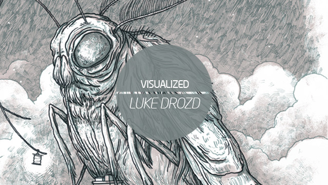
I have also just completed a poster for Swans, who were on my poster ‘wishlist’ of bands for some time so I’m happy to have ticked them off, as well as being quite happy with the results. It features a giant moth, pilfering keys from a suburban house using his very long tongue. What he intends to do next is anyone’s guess. He looks like a bastard and I for one don’t trust him. Process wise, this was created using the same techniques I employ for all my posters. It’s all hand drawn/inked in layers and then scanned in and tweaked in Photoshop. Increasingly I do as much as possible by hand rather than in the computer box. All the textures are pretty low-tech, and include scanned old rags, charcoal on different toothed paper and pencil shading. There’s probably much quicker ways to make all my work, but this is the way that I enjoy and works for my simple mind.
Fine art wise, I’ve chosen two pieces that perhaps illustrate different facets for the way I make things. I collect and hoard a lot of things, not necessarily with the intention of using them in a piece of work, but just because certain objects trigger something in me. Totem Palm started with one of those collections, a series of rolls of different coloured or interesting tape I had begun to amass in my studio. The collecting became a bit more focused and this totemic pillar of tape began to emerge. In the end the resulting sculpture, topped with a fake plant and sitting on it’s packing island, is part monument and part fantasy, pagan island. The collection elicits a response from me and suggests other materials, objects or ways of working that will allow it to become something else.

This idea of a sort of ridiculous totem is carried on through a piece like Deep Blue (Purple) [pictured below], but this time I wanted a sort faux mystical/new age crapness to it. I guess I hope it promises more than it delivers, if that makes sense. Both pieces come out of making decisions while you make. These are sculptures that emerge from shuffling, arranging, selecting and deleting as you go. They are about their individual elements but also how these work as a whole, and I hope they don’t resolve themselves to quickly or easily, but also my desires and thoughts about the things that surround me and also an attempt to effect others, for better or worse.